

Guest Writer
Today’s post is written by Justin Hardy, our 2020 Spring intern.
Heatmaps in Sports Analytics
As someone who’s interested in sports analytics, one visualization tool I see used a lot is a heatmap. In basketball in particular, heatmaps are frequently used to show a specific player’s shooting efficiency from various spots on the court.
For example:
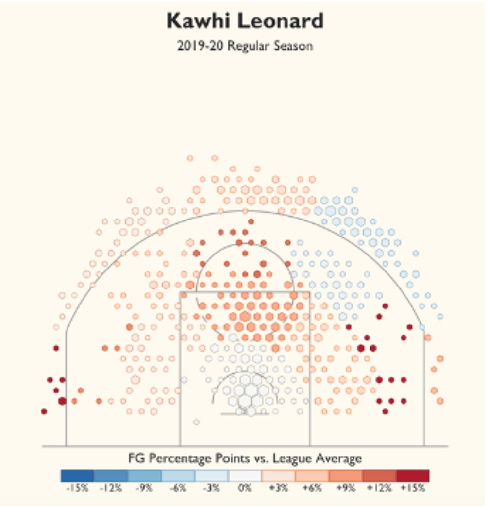
Figure 1.
This is a heatmap I created in R, drawing heavily from the work of Owen Phillips and Todd Schneider, showing locations on the court from where the NBA’s Kawhi Leonard attempted shots during the 2019-20 NBA regular season. Each shot attempt was grouped into a hexagonal bin based on where Leonard was on the court when he shot it. Then, each hexagon is sized according to the number of shot attempts that occurred from that spot. This style of shot chart can be very informative and useful to a variety of users. They can be of great value to analysts who are looking to learn more about different players’ strengths. However, they can be just as valuable for teams and coaches. For example, this information could lead Leonard’s coach to institute more plays to get Kawhi the ball on the right side of the court (his right side) or create three point shot opportunities from the right corner and conversely, as an opposing coach you might look to force him to go to his left if he has the ball at the three point line.
I was interested in exploring how this idea and style of heatmap could be applied to other sports and I decided to try to transfer this idea to the rugby pitch. In rugby the scoring is very different from basketball, so I decided to focus on kicking attempts only. This includes both conversion attempts and drop kick attempts. I wanted to look at the entire league’s efficiency from different locations on the pitch and more importantly, I wanted to view a specific team’s efficiency relative to the rest of their competition and a specific player’s relative efficiency. I used a sample of 400 kick attempts, which is a relatively small sample size, and for a particular team or player, it is especially small. To get reliable insights, you would want a much larger sample size, however, I believe that the sample is enough to show the value of this style of heatmap and show how it can be used effectively in a different context. Starting with the kick attempts from all teams:
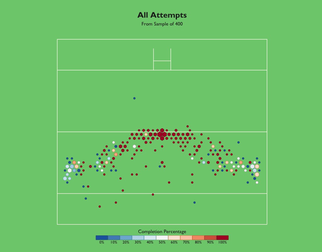
Figure 2.
This figure shows that, as one would expect, teams are more likely to score on a kick from the middle of the pitch as opposed to from the sides. Based on this, it makes sense that when a team scores a try, if at all possible, they should try to touch the ball to the ground as close to the middle as possible. While this is likely already what the conventional wisdom says, anytime you can use data to back up decisions, that is a good thing. Notice as well, that right in the middle and almost all the way at the sidelines the hexagons are largest, meaning the most kicks were attempted from these areas. Interestingly, it appears that even kicks attempted from farther away in the center of the field have a better chance of scoring than those taken closer, but from the sideline. Next, I focused on the success of a specific team in comparison with the rest of the field:
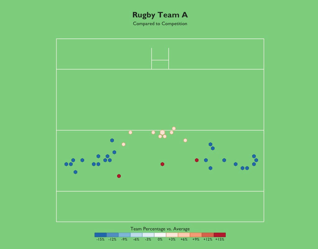
Figure 3.
Narrowing in on one team and their strengths and weakness can be valuable to that team’s coaching staff and front office and also help other teams with scouting. This is with a very small sample size but as an example, Figure 3 shows that Team A is far weaker than average from the wings but slightly better than average from the middle. Even more than normal, this team would want to ensure their tries are scored in the middle of the pitch so that they are able to consistently score on their conversions. Another key takeaway for this team is the hot shooting from the middle extends out to a long range. Assuming this trend continues over a larger sample, then kicking from long range may be a viable way to score for this team. Similarly, going into an upcoming match against this team, an opponent may need to change their defensive strategy to try and limit open kicks from long range.
Similarly, useful insights can be drawn by focusing in on the efficiency of a specific player.
For example:
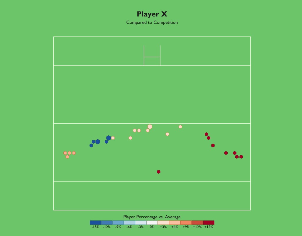
Figure 4.
Figure 4 shows a breakdown of player X’s efficiency relative to the average from various positions on the pitch. This might give the most useful information of the three rugby heatmaps. Player X seems to take slightly more attempts from the left side of the field than from the right, however, he is clearly more effective from the right side than from the left. As a coach of player X, if I knew this information, I would likely choose this player to kick the conversion if a try was scored on the right side of the field, but if a try was scored from the left, I would choose a different player to take the conversion. These are the types of insight that coaches and teams are less likely to have without this information and exactly why these heatmaps can be so useful.
This style heatmap can give such useful insights and I think there is lots of opportunities for them in other sports that are unexplored so far. For example, football (soccer) and baseball may seem like sports where this style of heatmap would be of little use, however, I think there are even more creative ways in which this could be used. In football, you could do something similar for efficiency when shooting but there are some issues with this. Firstly, that players mostly shoot from specific sides of the field based on their position, and secondly there is a goalkeeper. With each shot attempt being so unique, it may not make sense to follow the same idea as in basketball or rugby. Instead, I think it would be interesting to see a passing efficiency heatmap, with hexagon sizes based on the number of passes attempted from each spot and color to show completion percentage relative to the league average. If a specific team is struggling to score, this could lead to coaching decisions if they are struggling to complete passes in the opponent’s third of the field. Or conversely, if a team is struggling to score but they complete a high percentage of their passes in the opponent’s third, maybe they are playing too passively and too safe, which could lead to not enough high-quality scoring chances. Another unique way to use this style of heatmap would be in baseball, but, using the strike zone instead of a court or field. You could then see where a batter saw pitches and how effective they were at hitting when it was pitched low and close compared to high and away. Then you could separate the data by type of pitch to see they struggled with different areas depending on the type of pitch that was thrown.
In creating these heatmaps I drew heavily from the work of Owen Phillips and Todd Schneider, if you’re interested in understanding more about how exactly to create your own heatmap, I highly recommend looking at this blog post by Owen Phillips.
Feature image: Photo by W RUGBY from Pexels